Modernism is a movement which emerged in the early 20th century, of which was influenced by the development of the modern industrial focused society and the fluctuating social trends. It was very much focused on taking influence from the present as opoed to the past. Modernists focused on exploring with new medias and rejected the traditional forms of art and design; it was renown for using geometric patterns and minimal decoration. Sullivan stated that design should revolve around the principle of 'Form follows Function'. He believed that the shape of a structure should visibly reflect the functionality. Modernists eventually began to explore the idea of mass production; due to the ever fluctuating technology surrounding them.
Lot 8, Max Bill
Max Bill
Max Bill was a modernist artist who created typically minimal and structured pieces of work. He uses very bold colours, grid systems, and geometric shapes very often in his work and personally I find his work very appealing; very simple and minimal, however, very original. Colour is a big focus in his work as i fell it makes the most impact to a viewer, as opposed to line structures, etc. His work is exciting and can even sometimes create illusions, disorientating the viewer. I respect the man for producing a lot with little, creating such long lasting and effective pieces of work in history with such a simple ideology and method.
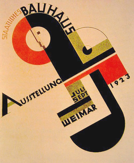
Bauhaus was essentially an art school located in Germany, founded in 1919 by a man known as Walter Groupius. His idea was to create an environment were all arts would be combined and collectively creating work together. Primarily teaching the principles of Modernism, Groupius aimed to teach the students a style which could be reflected in all forms of the arts; pushing forward Sullivan's 'Form follows Function'. This revolves around the idea of the design of a structure, whether that be a building or art subjects, should reflect its functionality; it was deemed unnecessary to decorate a functional object.
Bauhaus was attempting, with success, to avoid art losing its place in society; via uniting art and manufacturing. Modernism was a very good source for influence when trying to keep the art world up to date with the fluctuating culture and society views. After WWI had concluded, the consumerist society was born, and so the demand for material goods increased dramatically providing an opportunity for Bauhaus to promote the arts and raise up back into society's main front. They understood the relationship between society and its technology and attempted to unite them, allowing the products Bauhaus had created to be mass produced and available for the consumerist society.
Postmodernism arose in the late 20th century, more specifically in the 1960s. It was kicked into action via artists growing tiresome of the very strict and minimal ethos of modernism, wanting to have more freedom to express themselves. A very popular style that came from it was 'Pop Art'; taking its influence from the culture of the time. It was known for using bold colours, strong lineage, and not having many boundaries at all in the way of subject proving to be very different from the limited, grid-orientated manor of modernism.
The motivation of the movement was to bring back the freedom to art and design. It was renown for believing in the idea of deconstruction, specifically taking something apart in order to create something new and original. Influences would come from subject matter that most modernist's were cynical about, ranging from the past all the way to the present. Postmodernism was especially favored by the fine art would, as it took away the limitations modernism had put in place and allowed the artist to roam back to their traditional roots of art and design. One of the major differences between modernism and post-modernism is the fact that modernism's influences stemmed from the technology of the industrial focused society of the time period, where as post-modernism took influence from the ideology of taking apart and combining multiple subjects together to create something innovative and original.
Robert Rauschenberg
One of the earliest post-modrnist artists to rise was Robert Rauschenberg. His work is bursting with expression and is follows the rule of post-modernism to be totally free. Taking influence from the cultural surroundings, he rejected the idea of structure and the mechanical themes of modernism. Like a lot of pop artists, he made use of bold colours and expression in the context of overlapping and combining various images. Similarly to Kurt Schwitters, he used the collage technique, but in a very different way. As Schwitters was a modernist, you can distinctly see how his collages are structured with grid layouts and have very little decoration, whereas Rauschenburg's approach is to deem grid structure not even a consideration, displaying expressive chaos and a bold colour scheme. It is aimed to create an emotional response through images and themes that people can relate to and recognise. Personally, I love Rauschenburg's style, his influence on later artists and culture as a whole is brilliant and I would love to attempt to create pieces of work like his in my life.
Semiotics surrounds the exploration of the interpretation of signs. It heavily depends on how the individual's culture which surrounds him stands on shared values and understandings. Our cognitive thought processes and actions are governed by an array of cultural conventions and messages, and is subsequently dependent upon one's ability to interpret colour and symbols. A recognized example would be the category of road signs, warnings, etc. would look relatively the same no matter what country you find yourself in ; giving a global understanding of signs and meanings. Semiotics are divided into separate types or categories, one being heavily base don colour, and the other giving an precise and clear instruction.
Colour semiotics represents the method of a certain colour expressing a specific meaning. Obviously different cultures may in fact interpret colour in a varied amount of different ways, but the ideology is the same, colour semiotics is used to create a certain message, and trigger a certain emotion. Without really having to say, every culture has different morals, values, and shared meanings which causes the idea of each colour to be interpreted with different actions, emotions, thought processes, etc. The semiotic colour spectrum to the right measures how people from different cultures interpret colours, in actions or emotions. As displayed, each emotion is represented by more than one colour across the globe thus reflecting the cultural differences we have when it comes to colour meaning and stimuli.
Dadaism propelled many movements from its ideology, however, the most renown movement was Surrealism, founded in the 1920s. The Surrealist artists were notorious for attempting to explore the unconscious mind through expressive techniques. In order to reflect the language of the subconscious, artists often used juxtapositions in the work to portray more than one single reality, often presenting a creation which the viewer is not able to passively understand at first.
The more surreal the piece becomes the larger the difference in realities is; appearing dream-like. Surrealism has had a major influence on nearly every form of media and art, running form cinema to literature. However, surrealist influences are not very common in graphic design, aside from the likes of Saul Bass, especially in the world of typographic design.
Persistence of Memory, Salvador Dali.
Salvador Dali is by far the most famous Surreal artist, and one could say one of the most famous artists surrounding all movements of all time. His creations are renown for their detached reality aspects and incomprehensible themes. A well known example of his success is 'The Persistence of Memory', which depicts a very barren landscape with peculiar subjects in the forefront including a series of melting clocks. The meaning behind this painting is said to be inspired by Einstein's 'Theory of Relativity'. It is said to be reflecting how the concept of time in the dreamworld is eradicated, and how soon in a post-Einstein world, due to relativity, we will not be bale to keep track of tie merely using machines such as stop-watches or clocks.
Peronsally I love Salvador Dali's work, it laughs at everything that is wrong with the middle class world and their worries, whilst addressing problems that the typical human, no matter what era they find themselves in, often ponder and question. As we grow older we lose the heightened ability to use our imagination in everyday life, which saddens me deeply. Dali, however, jolted a shot of adrenaline into society's imagination as a whole, and still reminds us to this day that the art of imagination is one of the most important elemnts we can use in our lives.
Universal Visual Language is the process of communication which uses visual material in order for it to be accessible to as many people as possible. It avoids language barriers, illiterate problems, etc. in the use of imagery and universal semiotics. It is often used in the design industry as the company's work may need to appeal to a global audience, for example, as apposed to a local audience were the language and cultural barriers would not be impeded. One of the founders of it is the one and only Bauhaus. In this time period it was not uncommon to be illiterate, and so Bauhaus had to find a way to overcome this communication barrier so they could teach all of their students. They used visual techniques such bold colours, shapes and textures to aid them in this venture, using it alongside verbal language as so to make the visual language not a stand-alone function but to go hand in hand with the verbal language. This method especially aided the students who were lacking in discipline, allowing them to focus in a totally different perspective on such things as the contextual element of art and design. Bauhaus was filled with intimidating names such as Klee and even Kandinski. These two artists were two of a handful of artists and engineers who developed visual language, and they later went on to create a successful textbook, 'Language of Vision', explaining the fundamental values of visual language.
Graphic Designers often use the grid system when setting up the layout of any work they produce, whether that be posters, typography design, etc. It is constructed of intersecting lines on a page that enable a structure to be formed to a piece. The structure is there to allow the designer to organize the work, whether that be text, image, etc, in order to for the presentation and message to be observed more clearly. It is used at its best ability in newspapers, posters, magazines, etc. The system is favoured specially by the Modernist movement, the artists feeling very satisfied with the added structure to the layout of their work. The designer Muller-brockmann believed that using the grid would allow a designer to discover their own unique style in the method of laying out their work-
“
The grid system is an aid, not a guarantee. It permits a number of
possible uses and each designer can look for a solution appropriate to
his personal style. But one must learn how to use the grid; it is an art
that requires practice. ”
-Josef Müller-Brockmann
The grid can also be percieved as acting as an aid for artists; allowing them to seperate an image into different portions making the piece of work more organised and easier/less-formidable to approach (this especially applies to painters). In the context of creating lettering and images, the typographer Wim Crouwel used the grid system with enthusiasm throughout his typographic work.
Wim Crouwel
Wim crouwel is a renowned modernist artist who notoriously used the grid structure as a foundation for his creations. Quite often seen in his work is that the solid block shapes often flowed across the exact same lines as the grid, and so the grid would technically be the exact compositional component of the piece. He often created his designs for posters, exhibitions, etc. due to his work possessing such a structured ethos; reveling in minimalism and clarity. One of his most famous works is the creation of the typeface 'new alphabet'. It consists of a very jaunty grid-like appearance, taking inspiration from the very limited and early display technology, 'Cathode Ray tubes'. Personally I am not a huge fan of this type of typography as I feel the modern-aesthetic of letters appears too cliche.
During this lecture we were given the task of watching several video clips of Christmas advertisements and answer various questions to do with clips. As we watched the videos we would note down bullet points of what we observed from each clip.
The Questions:
1. What messages are being communicated in each example?
2. What techniques are used to communicate these messages/how do we read them as having a specific meaning? 3. What is the relationship between the communicated meaning and the product that the advert is trying to sell? 4. Which advert do you think are the most effective and why?
Clip one: Tesco:
- Orientated around the idea of 'togetherness'.
- The sharing idea of Christmas.
- Focuses on family.
Clip two: Asda
- Focus on 'Mums'.
- Emphasizing the cheapness of the cost.
- “Christmas doesn’t just happen by magic, behind Christmas there’s mums, behind mums there’s Asda”.
- Focuses on family and the stress of Christmas, and how Asda is there to aid us in this pressured but joyful time.
Clip 3: Mark's and Spencer's
- Element of magic.
- New clothes and new fashion lines being promoted.
- Aimed at the middle class audience.
- Very materialistic.
Clip 4: Lidl
- Family orientated.
- 'Togetherness' acting as a main theme.
- Using positive connotations of other stores to promote their own food.
Clip 5: Sainsbury's
- World War One themed.
-One of the most famous stories of WWI used to promote their store.
-'Togetherness', again, plays a big part here.
-‘Christmas is for
sharing’
-It's motive is to focus in on the emotions of people.
Which do you believe is the most effective advert?
Each one of the adverts we have looked at typically show evidence of making the viewer's Christmas easier and more practical, most focusing on the family aspect of this. They each are trying to cover the viewers eyes with a veil reflecting how the store has its best interests in the British families. Personally, I think the advert Sainsbury's concocted was the most effective. They used a story of which everyone in Britain is very familiar with, the Christmas Day football game during WWI. It reflects the idea of Christmas bringing everyone together and is conveniently supported by the Poppy campaign, helping the audience to tap into their emotions just a little bit more with the approval sticker of the campaign. I think this advertisement was by far the most memorable advertisement we looked at, thus the most effective in what it was trying to achieve.
In our lecture we were presented with a short film covering Bauhaus and its endeavors. We were then given various questions to answer based on the film.
Which key ideas constituted the Bauhaus philosophy?
The Bauhaus' place in history is owed to its successful efforts of preventing art from losing its stature in society. The method of doing this, in a rounded up description, was through reuniting creativity with the manufacturing world. They gained major inspiration from Modernism and the fluctuating society; enabling them to stay steadily along the path of the social trends of the time. The artistic giants used the concept of universal visual language in order to allow it to be accessible to nearly everyone (in this time period many people were illiterate), teaching the principles of Modernism to be able to be applied to all forms of art and design to collaborate and create. Bauhaus' relentless ideology of experimentation drove them to constantly be getting a name for creating interesting and innovative work. Often using geometric shapes and primary colours in their work on mixed media they attempted to show the link between their world and the new more structured technological world.
Collaborating with Wim Crouwel they were able to teach students about the theories of the grid structure, building the ideology of work having a foundation of structure and a minimalistic style, rather than the traditional free and flowing artwork of the time. Bauahus developed on top of Modernism with other influences from such movements as cubism, constructivism, etc. They often declared how their works was based more so on the principles of engineering than of art.
In what ways were these ideas
innovative or new?
Rather than sticking to the traditional forms of art and design, Bauhaus decided to experiment with new materials and mixed media, taking heavy inspiration from Modernism, which was strongly linked with the new industrial focused society. Modernistic artists such as Kandinsky were creating inspiring original pieces of work of which screamed tones of the old ideologies being rejected and the new ideologies of what the artist felt directly coming in. The overseers at the Bauhaus would encourage would strongly encourage the use of experimentation and ever fluctuating methods. For example, in the instance of photography, the subject would then not be looked at just as a mere photograph but as a means of visual communication, later developing into the process of 'photomontage'. The 'Metallic Festival' was created and its intentions were of a modern aesthetic, of which is successfully accomplished; influencing many artists into creating work strongly connected to the industrial focused society.
How was art education revolutionized under Bauhaus principles?
In the midst of 1919, Bauhaus remained the only school of art in the entirety of Germany. For the whole of the first six months of the course it offered, students would be taught abstract theories and a multiple of techniques and styles. For example, students would be allocated the task of collecting metal debris and discovering what elements and materials were used to create them, then experiment with these new materials. It was only when Bauhaus was created when the new 'Modernist' student was created, before this the conformist art student typically would be traditional, focusing on landscapes, portraits, actual physical things.
Do any of the principles
resonate with you and your studio practice? If so, which ones and why?
In my humble opinion, I believe elements of the Bauhaus theology and ideology is present in the structure of our work to this very day. For example, in a lot of areas of our studio practise we are advised to use grid structures in the layout of our work which allows the work to be more clear, sophisticated, and professional. The software 'InDesign' allows this structured layout method to be used, reflecting Bauhaus' principles.
In the mist of 1916, the movement Dada revealed itself. It was provoked by the first world war, a counter-reaction against everything it stood for, and everything it caused: unimaginable fatalities, narcissistic chaos, propagandizing advertisement, etc. One of its many influences was held by the pre-war Avant-garde movement; displaying strong elements of experimentation and subjectively innovative nature, throwing in to the mix degrees of political culture. Pushing the boundaries of cultural conformity, many viewed and labelled the movement as 'Detached from Reality'. An extraordinary value that Dada holds is how the viewer is never expected to interpret a piece in the same reception as the next viewer, which is common in many art movements but is especially prominent in the Dada revolution.
[...] First Epoch of the Weimar Beer-Belly Culture, 1919, Hannah Hoch
One of the techniques present in Dada, 'photomontage', was used to convey the breakdown and destruction of societies. The artist Hannah Hoch used this technique frequently in her works, tending to create surreal and abstract collages; often mirroring an image to the viewer of which is harrowing and true to the context. Personally, I find it amazing how this artist was able to create such prolific and ambitious collages with the lack of technology and mediums around at the time, and I think it Hoch's work is collectively without any dubious subjective opinions an outstanding period for Dada.
In the associated group lecture, me and the corresponding students were given the task to browse through various articles consisting of a very wide range of topics. Following this, we were allocated to answer various questions concerning the single article we picked out of the choices. I wanted to be in a position were I was very much out of my comfort zone and knowledge area in order to answer the questions with fresh eyes and opinions, thus, I chose the article 'Dazed and Confused', a women's fashion review of the Spring 2015 edition.
Question number one; 'How does the example play on the viewers emotions to achieve its effect?'
Dazed and Confused, 2015
The article's motive is to target the parental members of the magazines viewership. Its intentions are to shock the intended viewers and to cause negative emotions to arise; in sorrow and distress. The shock factor is channeled through the clothing presented, subconsciously and even consciously making the viewer connect what is presented to their children. The model poses in vulnerable positions; sporting a white laced dress shouting innocence out of the page. The mix of emotions we as the viewer are intended to feel; sympathy, maternal, horror, are all executed brilliantly. The article successfully informed the audience through limited resources, offering merely images with little text. The article promotes the idea of clothing being a screen enabling someone to portray their personality and culture through. Thinking about this idea, what could the clothing presented here be saying about our culture? Many possibilities, the strongest of them all, however, is we have a very confused relationship with the idea of child and maturity, and it is getting mixed together far too often, not in a tasteful way.
Question number two; 'How does the example depict women/men? How is the gender used in this example to sell a product?'
The example depicts women in a very vulnerable situation accompanied by the poses the model has been instructed to adopt. The essence of innocence is the selling factor here and so the model has been used to connect with the audience's self of which subconsciously longs to be 'pure' again.